13 years in Detroit
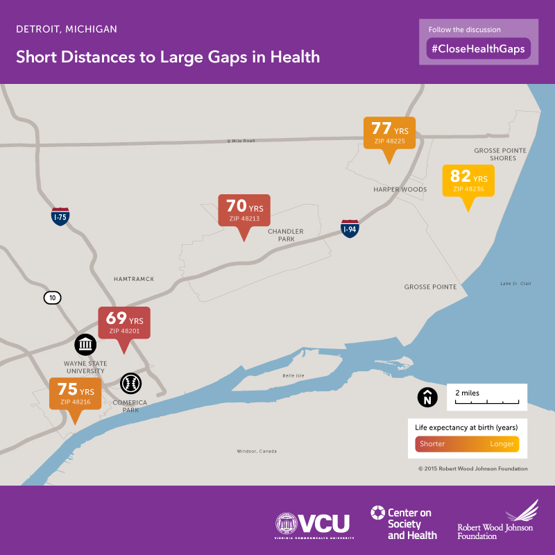
This map is one in a series of life expectancy maps, developed to illustrate that opportunities to lead a long and healthy life can vary dramatically by neighborhood.
The aim of these maps is to serve as a resource—raising awareness of factors that shape health and spurring discussion and action on a complex web of factors that influence health. In this case, the average life expectancy in Midtown is 69 years, 13 years shorter than for babies born in the Grosse Pointe area, just a few miles up I-94.
Why are some neighborhoods so much healthier than others?
Gaps in health across neighborhoods stem from multiple factors:
- Education and income are directly linked to health: Communities with weak tax bases cannot support high-quality schools and jobs are often scarce in neighborhoods with struggling economies.
- Unsafe or unhealthy housing exposes residents to allergens and other hazards like overcrowding. Stores and restaurants selling unhealthy food may outnumber markets with fresh produce or restaurants with nutritious food.
- Opportunities for residents to exercise, walk, or cycle may be limited, and some neighborhoods are unsafe for children to play outside.
- Proximity to highways, factories, or other sources of toxic agents may expose residents to pollutants.
- Access to primary care doctors and good hospitals may be limited.
- Unreliable or expensive public transit can isolate residents from good jobs, health and child care, and social services.
- Residential segregation and features that isolate communities (e.g., highways) can limit social cohesion, stifle economic growth, and perpetuate cycles of poverty.
To build a Culture of Health—where every person, no matter where they live, has an equal opportunity to live the healthiest life possible—we must improve people’s opportunities to be healthier in the places where they live, learn, work and play.